
Chime In-House, Chime’s internal creative agency, delivers more than 90% of Chime's creative. Most recently, the team rebuilt Chime’s look as a living, AI-native system that keeps our brand's soul, costs a fraction of past brand work, and puts production in the hands of our whole team.
"Our brand has always set us apart. We are both a functional and emotional choice for our members. People don't just use Chime, they love Chime,” said Ryan Brown, Head of Creative at Chime. “But as our members and our business grew, the brand needed to grow up with them. We needed to mature the brand without losing the things that made people fall in love with us in the first place.”
The harder problem wasn't how the brand looked, it was that our brand simply wasn't built to scale. For example, all of our illustration ran through one person. To move forward, we had to evolve two things at once: Chime’s visual identity and the creative operating model behind it.
Chime In-House led the whole effort in close collaboration with our Product Design team, with leadership support from the very top. We didn't commission a traditional overhaul. Instead, we rebuilt the brand as an AI-native production system with our dedicated Creative Lead of AI who builds the workflows that let it scale.
"We're a small team and challenged ourselves to be at the cutting edge of AI," said Brown. "So we asked a different question: What if the brand itself was designed to scale beyond what any of us could physically produce? Instead of just adding AI to the process, we designed the new system around it."
Visual identity as a living system
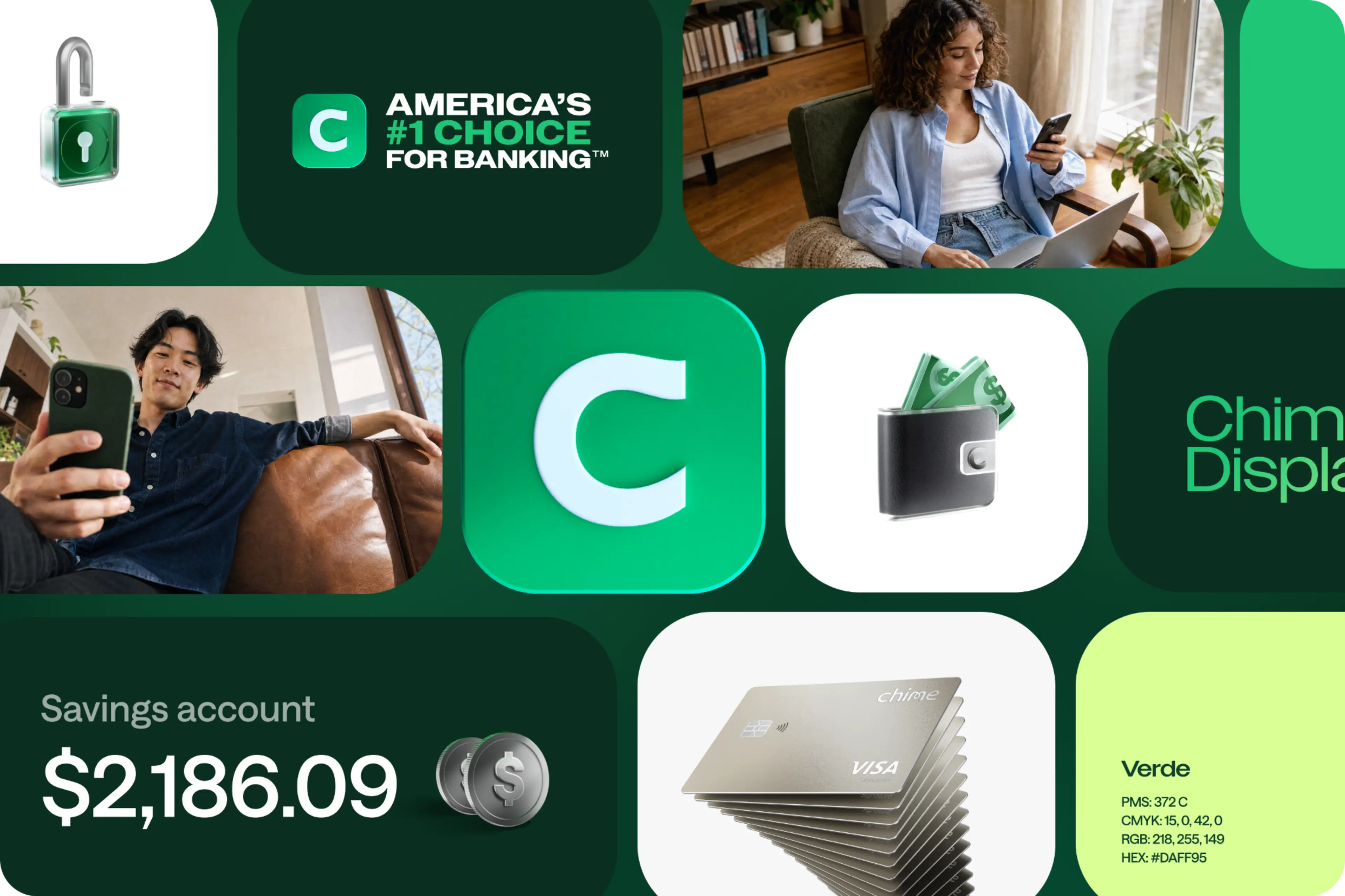
The central idea was to treat the visual identity as a living system, not a set of static assets. Chime In-House rebuilt our illustration style, photography, and iconography as custom generative AI workflows designed around our own creative, so every output stays unmistakably Chime. Custom models are trained to build our 3D iconography, so we can explore and iterate far more than we ever could before.
"This puts the creative work in the hands of our multi-hyphenate creatives,” said Brown. "It creates more flexibility, speed, and agility for us to operate with.”
An evolution, not a reinvention
Just as important is what didn't change. Chime's core brand strategy held, and so did our colors. The look became simpler, more energetic, and more stylized, and it remains recognizably Chime.
Our evolved type system introduces Chime Display, expanding our typographic expression. It creates more opportunities for bold typography that brings energy, personality, and impact to our brand.
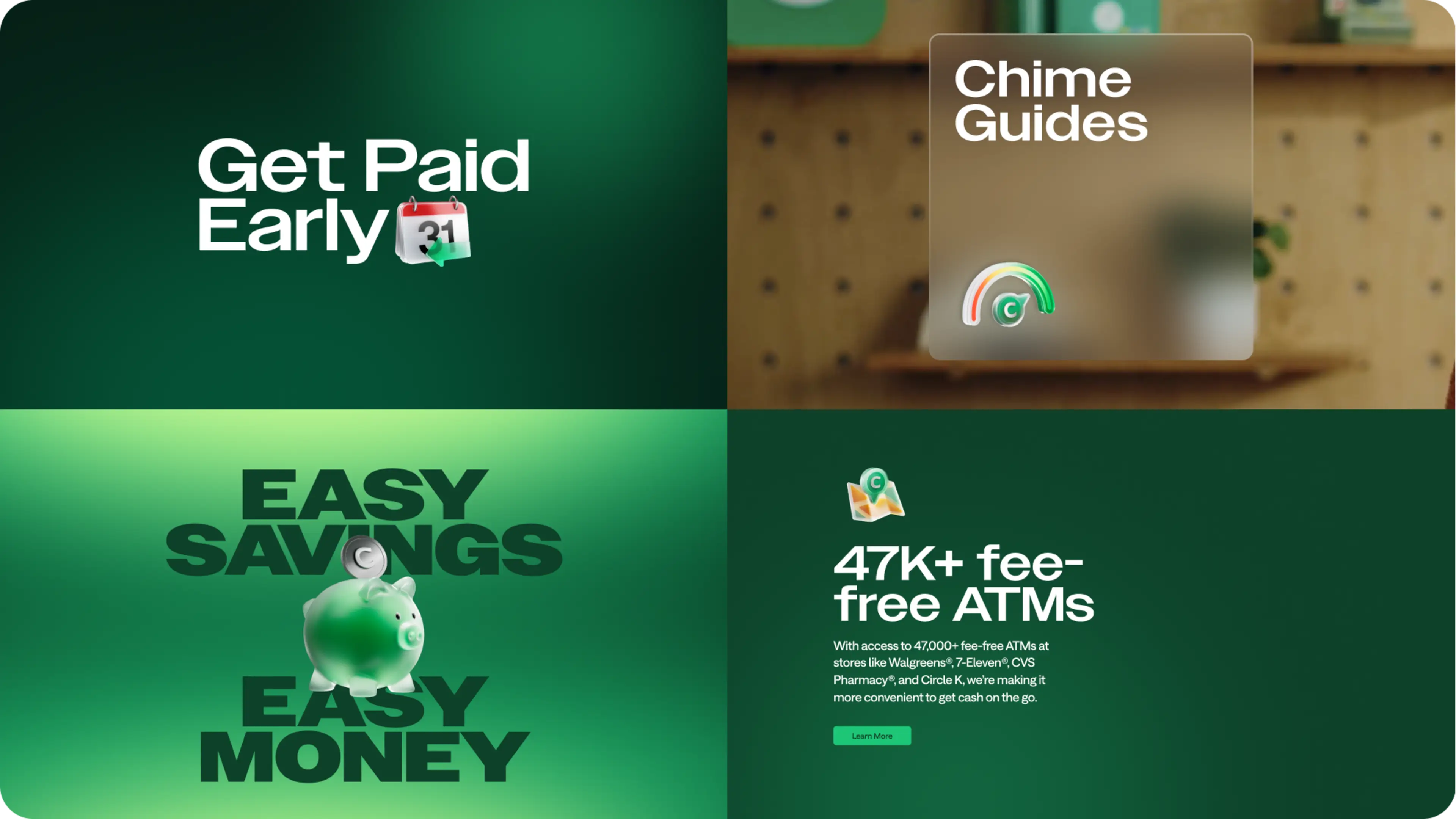
Speed is a big part of the story too. The work kicked off in January 2026 and was revealed in April. In those few months, Chime In-House flipped the brand's biggest touchpoints: the homepage, main landing pages, top-of-funnel campaigns, and social. We were strategic but not precious about where we applied the new look first. That's the kind of nimbleness the in-house model was built for.
And the financials are just as striking. The brand evolution cost less than 10% of our previous brand work, and the new system has generated several million dollars in savings.
Integrating AI-enabled workflows has:
Increased creative output by 377%
Reduced production time per asset by 60%
Tripled testing volume
That money doesn't just disappear from our budget. It gets reinvested in making better creative.
Plenty of brands are using AI to make ads faster. Our approach is about ownership. Chime In-House has built our visual identity as a system we own and run ourselves, one that grows with our brand and not the headcount, and we believe that's where great consumer brands are headed.